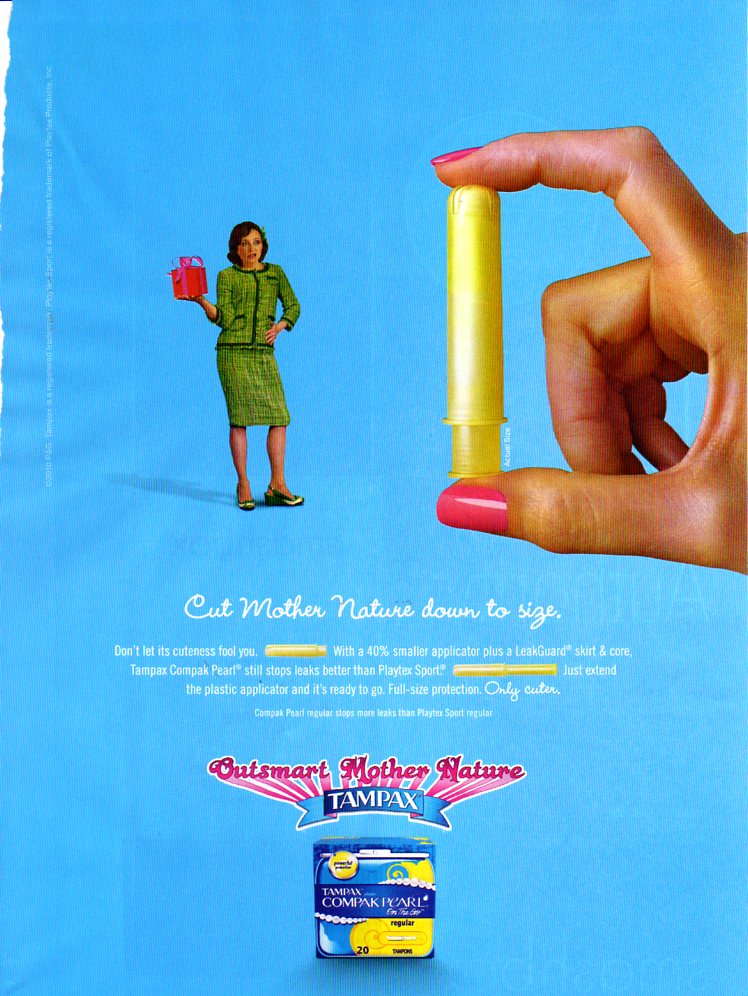
Is it just me, or is Tampax’s “Outsmart Mother Nature” campaign wearing a little thin?
These two ads, from the June, 2010, edition of a ladymag, seem lackluster. Visually, they’re just not easy to read.
Serena burns a hole into Mother Nature’s monthly gift? She damages menstruation? How are we to interpret this image?
This one is also a little strange. Cut Mother Nature down to size? Doesn’t this imply reducing one’s period, which is more consistent with the advertising slogans of cycle-stopping contraceptives (e.g., Re-punctuate your life with Seasonique)?
When did the wheels fall off this one, Tampax?


It’s definitely wearing a little thin. I saw the TV spot related to the “Cut Mother Nature Down to Size” ad last night while watching Glee. What a contrast to the new Kotex campaign with the neon packaging attempting, at least, to take a bold, matter of fact approach to menstruation. One thing is certain, the ad agencies seem to be grasping at straws to find the right message to sell FemCare products. I wonder which ad campaign is doing a better job of this? It would be interesting to see the kind of campaigns the Diva Cup and Keeper people would launch if they had the money to do so.