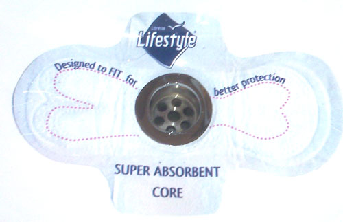
 This ad for Lifestyle stretch fit menstrual pads is actually a sticker placed over the drain in sinks of public restrooms. There are no flowers, no gauzy white dresses or white spandex pants, and it demonstrates the key features of the product, such as adaptable fit of the pad and absorbency, and there’s no blue fluid anywhere in sight.
What do you think, readers? Does it make you want to buy Lifestyle brand pads?
[via Copyranter, who tells us that this ad was produced by Johannesburg ad agency TLC Marketing]


I’m confused about the dotted outline on the pad. What’s that supposed to represent? A very rounded fish?
They’ll have to do better than that to get me to buy any pad at all!
I don’t get the dotted outline either. but I’ve heard of urinal cakes that have advertising on them. Similar in concept, I suppose. Though I could definitely go on a rant about how advertising is EVERYWHERE and even in some ridiculous places, like this.
Ideologically, I am 100% in favor of functional menstrual product advertising.
Practically, though, I have to admit that my first reaction was, “WTF? A pad with a great big ol’ hole in the middle? What the hell good is that going to do?”
I think the dotted line is supposed to represent the contuors of the pad.
Okay, sure…but weird contours.